Create Charts & Graphs
Instantly with AI
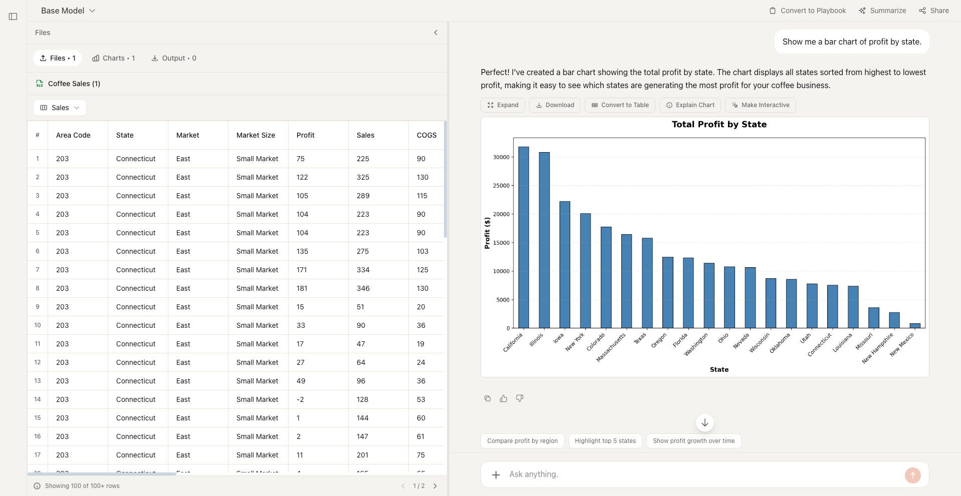
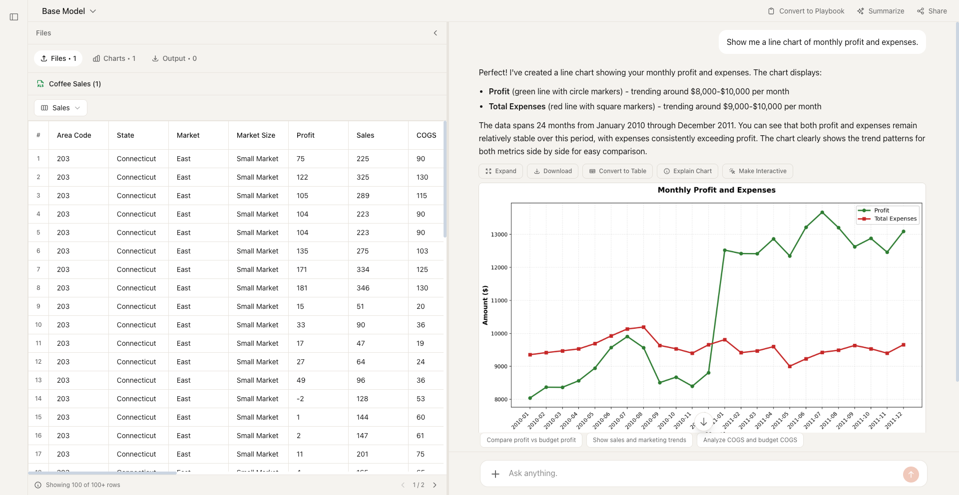
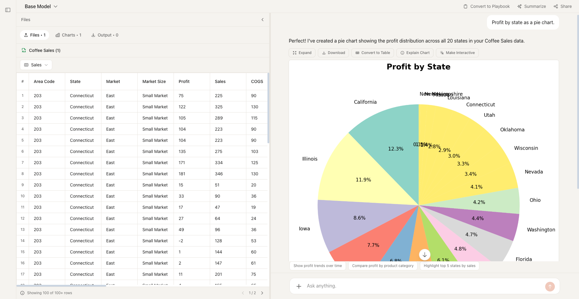
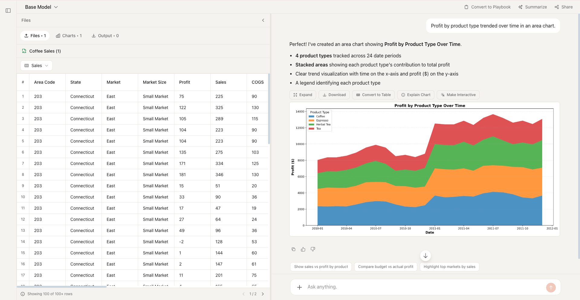
Describe the chart you need in plain English. Formula Bot creates bar charts, line charts, pie charts, scatter plots, and more — instantly.
Chart Types You Can Create
But not limited to — just describe what you need.
What is an AI Chart Maker?
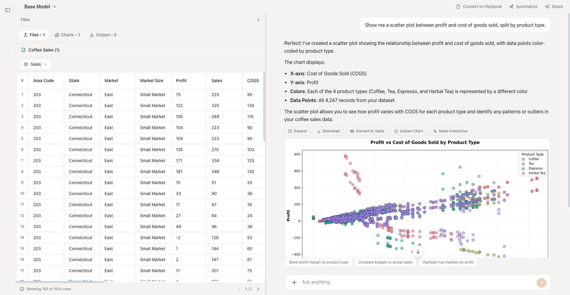
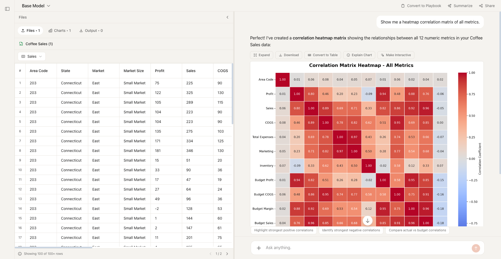
An AI chart maker turns raw data into clear visualizations automatically. Instead of spending time selecting chart types, configuring axes, and tweaking formatting, you describe what you need and the AI handles everything—from choosing the right chart type to producing a polished, presentation-ready graphic.
Formula Bot's chart maker goes further: upload a spreadsheet or paste your data, ask a question like “show me monthly revenue by region,” and get an interactive chart in seconds. It supports bar charts, line charts, pie charts, area charts, scatter plots, heat maps, and more.
How to Create Charts with AI
Upload or describe your data
Paste a spreadsheet, upload a file, or describe the data you want to visualize.
Tell the AI what chart you need
Describe your chart in plain English — "bar chart of Q4 sales by product" works perfectly.
Get your chart instantly
Formula Bot creates a polished, presentation-ready chart in seconds. Iterate by asking for changes.
Why Formula Bot for Charts
Describe charts in plain English — no menus, no manual configuration.
The AI recommends the best chart type for your data automatically.
Go from raw data to polished visualization in seconds, not minutes.
Charts automatically match your preferred theme for any presentation context.
Frequently Asked Questions
Still not sure that Formula Bot is right for you?
Let ChatGPT, Claude, or Perplexity do the thinking for you. Click a button and see what your favorite AI says about Formula Bot.
Ready to Create Charts?
Describe the visualization you need and get a polished chart in seconds—no coding or design skills required.